Magic Packaging
Unboxing a new product is like meeting a new person for the first time. The right packaging can communicate the product’s values and its friendliness, just like your clothing can broadcast whether you are creative, reliable, approachable or unachievable. Well-designed packaging can support a delightful and efficient learning experience, helping you to fall in love with your new product.
After our strategic project Out of the Box for Samsung in 2010, we have transformed many unboxing experiences, introducing some of the most advanced products and devices to people worldwide. Our involvement in most of these projects remains confidential but in the spirit of open innovation, I would like to share the 10 principles we use when tackling these interesting challenges.
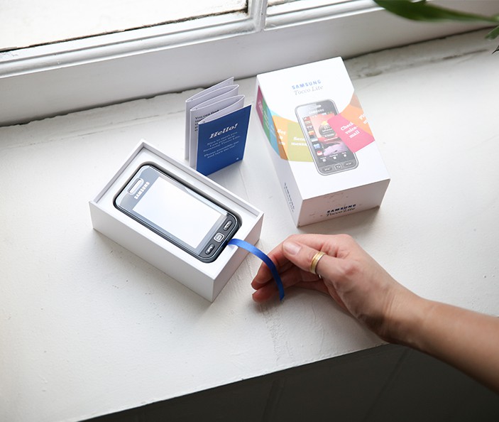
Principle 1: Show the product in all its beauty, now!
Showcasing the product as soon as you open the box is essential. Remove every obstacle that hinders the view or touch, and stay away from straps, stickers, and packaging that is a struggle to open. If you can, show the product on the box itself in real scale with no frills or special effects. Be confident in its beauty. Unless one of the product’s values is secrecy or mystery, avoid masking the product under layers of wrapping materials.
Principle 2: Use as little material as possible
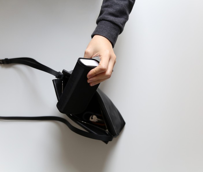
It is paramount for designers to consider the environmental impact of their designs. Use as little material as possible to reach your goal. Ask yourself what is the bare minimum needed to protect and explain this product to its end user. Make the box as small as possible. This will not only help save the planet but will also cut shipping costs and make retailers happy by occupying a small shelf space. Think about reusability of the packaging and use recyclable or recycled materials.
Principle 3: Follow the white rabbit
The best unboxing experiences are like a magical journey of discovery. Guide people through the process with colours, clues and cutouts. The end user should feel like Alice in Wonderland following the white rabbit. Build in some delightful and magical elements that link the experience into one powerful journey.
After our strategic project Out of the Box for Samsung in 2010, we have transformed many unboxing experiences, introducing some of the most advanced products and devices to people worldwide. Our involvement in most of these projects remains confidential but in the spirit of open innovation, I would like to share the 10 principles we use when tackling these interesting challenges.
Showcasing the product as soon as you open the box is essential. Remove every obstacle that hinders the view or touch, and stay away from straps, stickers, and packaging that is a struggle to open. If you can, show the product on the box itself in real scale with no frills or special effects. Be confident in its beauty. Unless one of the product’s values is secrecy or mystery, avoid masking the product under layers of wrapping materials.
It is paramount for designers to consider the environmental impact of their designs. Use as little material as possible to reach your goal. Ask yourself what is the bare minimum needed to protect and explain this product to its end user. Make the box as small as possible. This will not only help save the planet but will also cut shipping costs and make retailers happy by occupying a small shelf space. Think about reusability of the packaging and use recyclable or recycled materials.
The best unboxing experiences are like a magical journey of discovery. Guide people through the process with colours, clues and cutouts. The end user should feel like Alice in Wonderland following the white rabbit. Build in some delightful and magical elements that link the experience into one powerful journey.
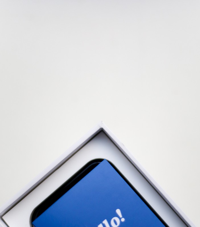
Accessories, cables and instructions should be presented in the order in which they are needed. If you do not need all the components to get started, consider creating different ‘layers’ in the box. For example, you might have a ‘getting started’ layer and an ‘explore further’ layer in your box.
A common mistake is to design the product in all its glory and leave the instructions to last, as a 2D layer of information often contained in a flimsy manual. Steer clear of that, instead considering how the instructions, when integrated into the packaging, could guide the user through the correct use of the product. Make the instructions easy to handle and think about the context of use. Will they be needed again and again? Will the product be used in a wet environment such as a bathroom or pool? Will it be used outdoors or in the darkness? The instructions should be designed with the context of use in mind.
We believe in calm technology, and therefore always design products and services that integrate seamlessly into people’s life and require the minimum mental bandwidth possible. When designing packaging and instructions we strive to obtain the same balance. Reduce the instructions to their bare minimum to operate the product correctly. Strive for simplicity, reduce the effort required by your audience. You don’t want the product to be perceived as demanding and difficult, but approachable and accommodating.
The unboxing experience should be inclusive and empower any users to get started and to enjoy their new product. To achieve this, simplification is fundamental - as explained in Principle 4. We therefore suggest separating this early information from pro-tips. Pro-tips can live online, giving you the opportunity to continue the dialogue with the most involved customers and creating an active online community.
We always come back from our trips to Japan in awe of the way their Bento boxes are proudly organised. Things organised neatly are not only a delight to the eyes but also a way to convey a very clear overview of things. Organise all the accessories and cables in a neat way, and avoid chucking things in plastic bags at the bottom of the box.
When something is crucial, create a plan B. If a set-up step is very important, don’t be scared of repeating it. The secret is to prompt the user in two different locations.
The packaging and unboxing experience is a wonderful opportunity for you to build a rapport and continue the dialogue with your users. Do not underestimate this touchpoint, and make sure to convey your product and brand personality across it. Last but not least, make sure to leave your customers in a good mood. The purchase moment is not your end goal, it is just the beginning of a long relationship between your brand and your customers.
Make sure that they start the life with their new product on a high, with a positive, happy feeling in their heart… Just like you would feel after meeting a wonderful new person.
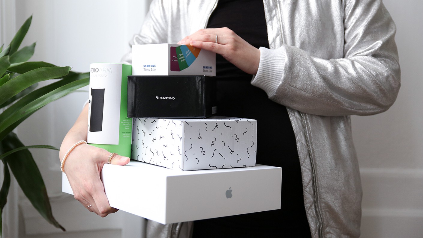
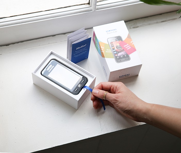
You can see examples of some of our packaging work on our projects for Samsung and Qardio.
