Client
Onaria Technologies
Year
2019
Brief
Create a truly delightful, accessible and unique user experience that could differentiate uunn in a saturated market.
Solution
Reduce stigma around dental health with a useful, empathetic and accessible dental health care product.
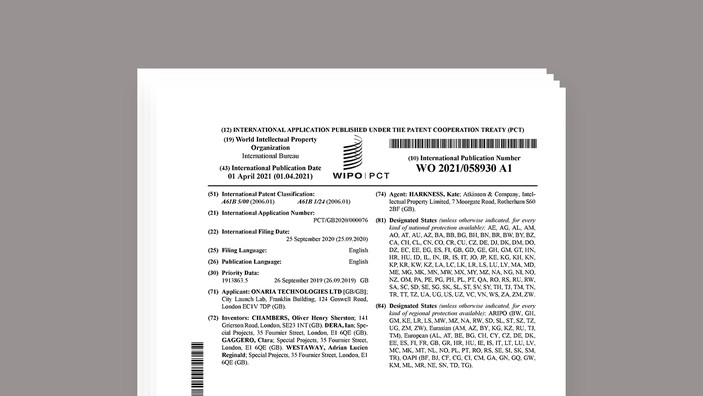
Patents
Related Projects
Download
Keywords
Industrial Design, User Interface, Experience Design, Calm Technology, Empathetic Technology
uunn
We worked with uunn to ensure that their detailed research and computer vision technology is communicated with a playful and delightful user experience. Our designs for the mouthpiece, app, brand and packaging create a consistent product eco-system which is sleek, accessible and environmentally friendly.
We love working with brave brands like Onaria Technologies who came to Special Projects with a brilliant idea: to disrupt the dental health industry by empowering people to improve their own dental health. They had a prototype, some compelling computer vision, and an astonishing amount of energy. With our guidance, they conducted user research to understand the needs and aspirations of their users, and working closely with the founders, we created a user experience which spoke to their users and provided exactly what they wanted, infused with playfulness and delight. Together we created a truly empathic user experience which would transform uunn’s potential for success, making them stand out in a saturated market.
Mentoring the uunn founders through their user research phase, we helped them to uncover the potential for innovation within their user’s aspirations, and worked with them to turn these into the insights that would underpin our design concepts. Their research confirmed that many people feel significant anxiety about attending the dentist for check ups and treatment, but also uncovered that many users even felt quite uncomfortable looking at images of their own teeth. Our bi-weekly mentoring sessions really embedded our user centered approach into their company and underpinned the product development and branding strategy that we went on to create for them, looking at every element of the customer experience holistically, before designing the mouthpiece itself, app, and packaging.
This project is particularly interesting right now as more and more healthcare interactions are taking place remotely. We have worked in this space in the past with clients like Qardio, for whom we designed a range of consumer health-tech products.
"Be in tune with your oral health using your smartphone. uunn is a digital tracker for your teeth - think of it as your personal hygienist."
Vogue
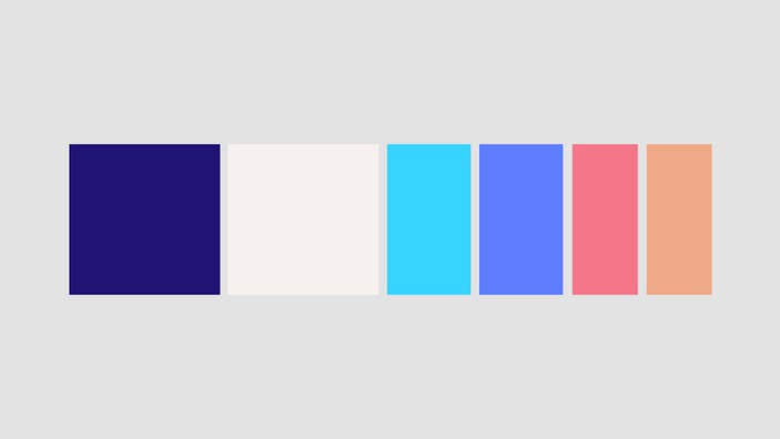
Our first piece of work was to create an identity for the founders which would humanise this potentially stigmatising activity - the name and logo demonstrate the playfulness which combats any potential anxiety users might encounter, the teeth in the logo hinting at the attitude of the founders to learning a new skill: it should be fun, entertaining and rewarding. The traditional blue of the colour palette grounds the product in the dental health industry, building trust with the user from the outset. This is offset by the modern and neutral tones of the palette, reminding the user that this is a new approach and technology to an age old problem.
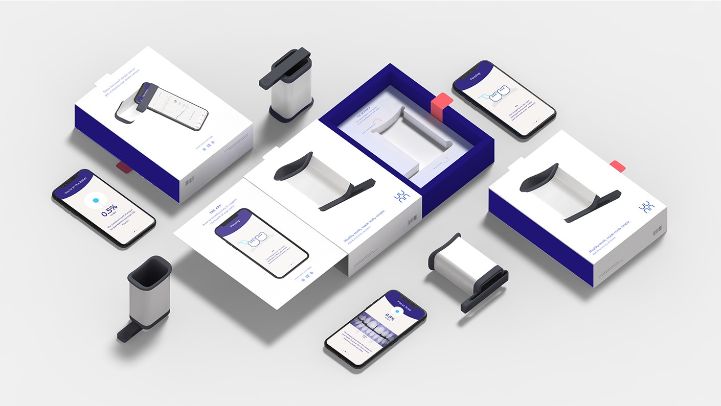
We went on to develop the packaging for the mouthpiece, the dimensions of which are as small as possible to reduce the carbon footprint of transportation, and postal costs for the user. Every element of the design is considered and the most user-friendly option employed. The box does not use unnecessary plastic and shows an illustration of exactly what is inside.
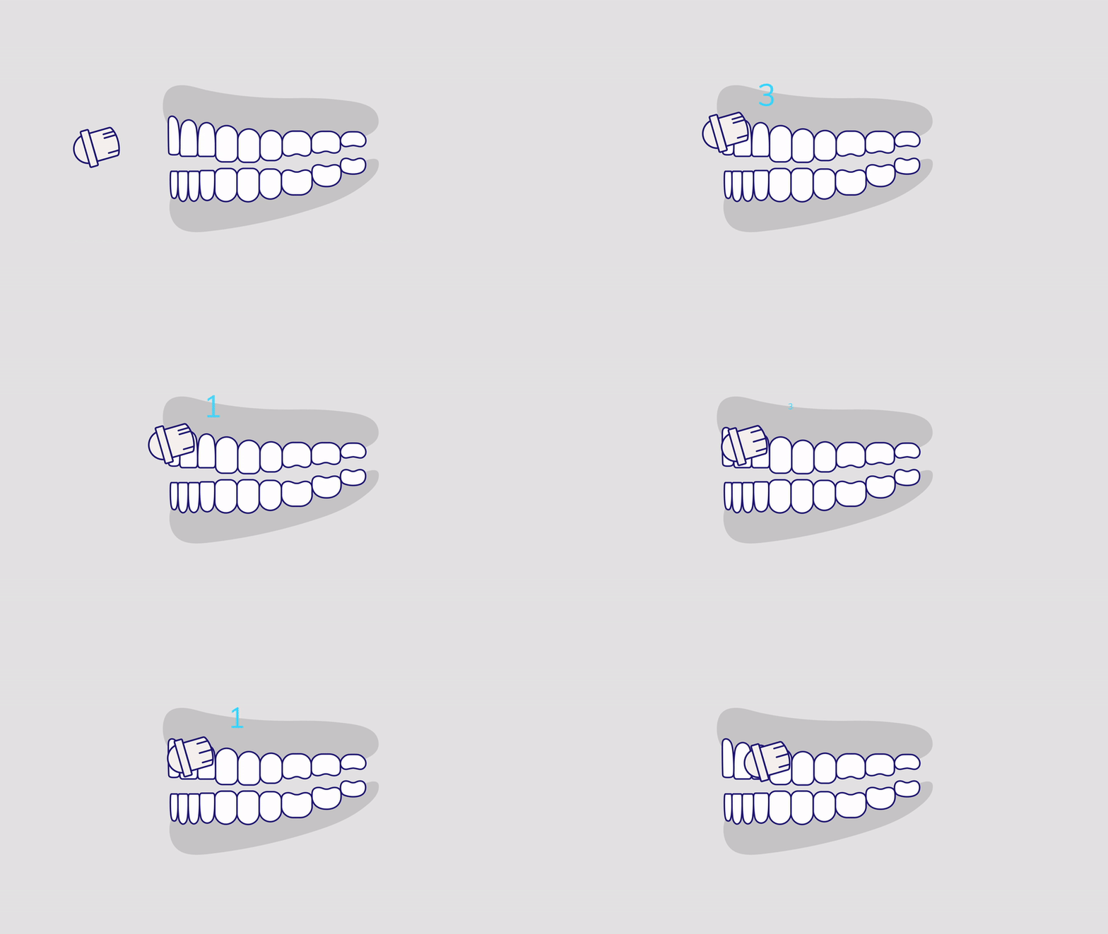
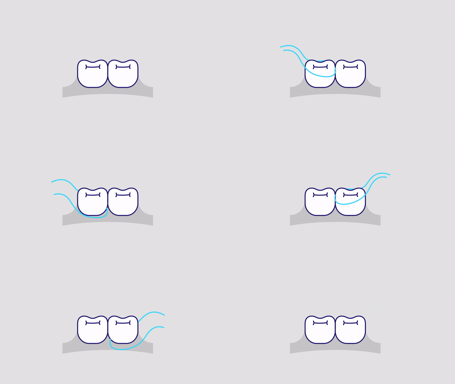
Playful animations act as mini-tutorials and teach the user how to get ‘in the zone’, reducing the plaque on their teeth with new brushing and flossing techniques. These are infused with a sense of childlike wonder, and entertain the user whilst demonstrating how they can improve their dental care, enhancing what can be a mundane and tedious experience.


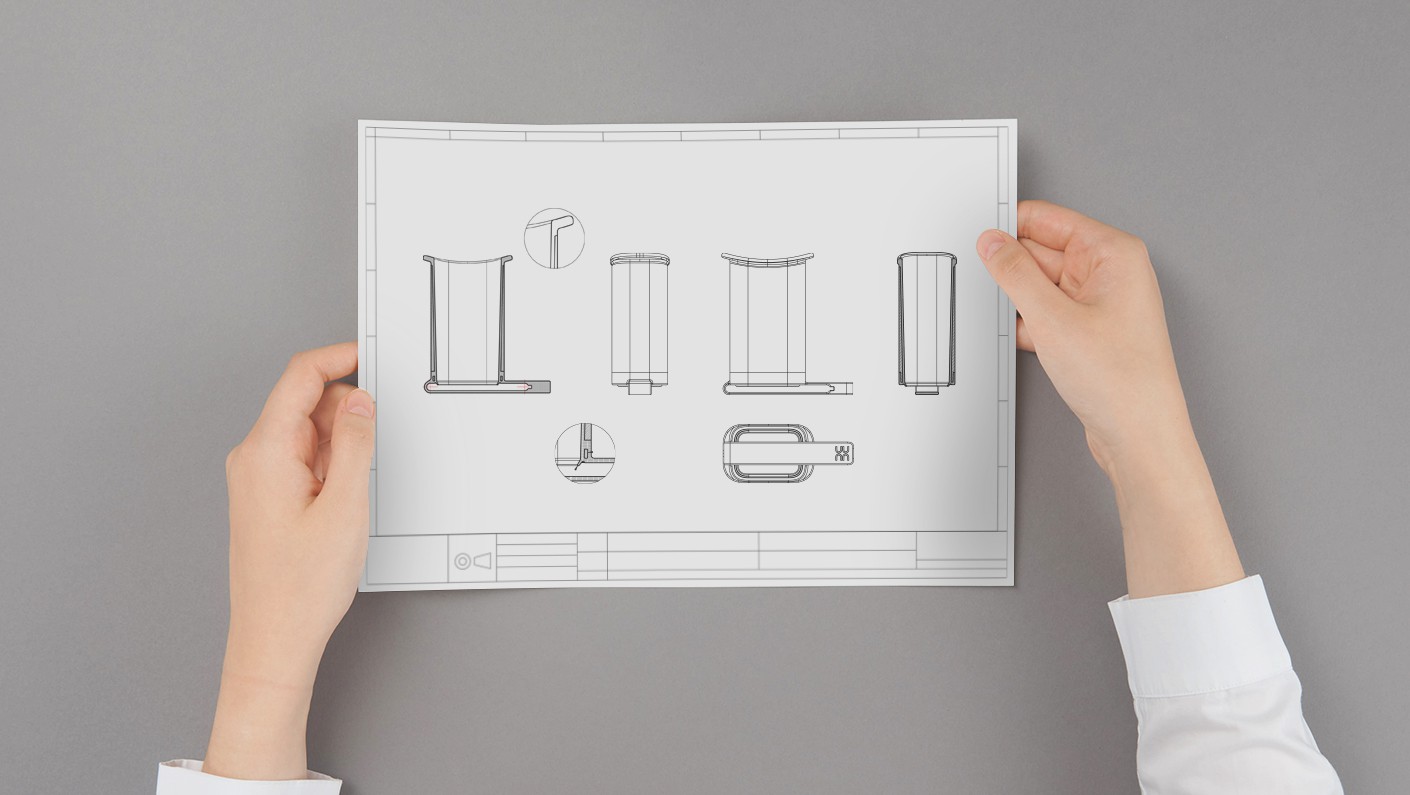
We explored a range of findings from uunn’s research, and worked closely with them to create a range of concepts and designs for the mouthpiece, taking user insights as our inspiration.
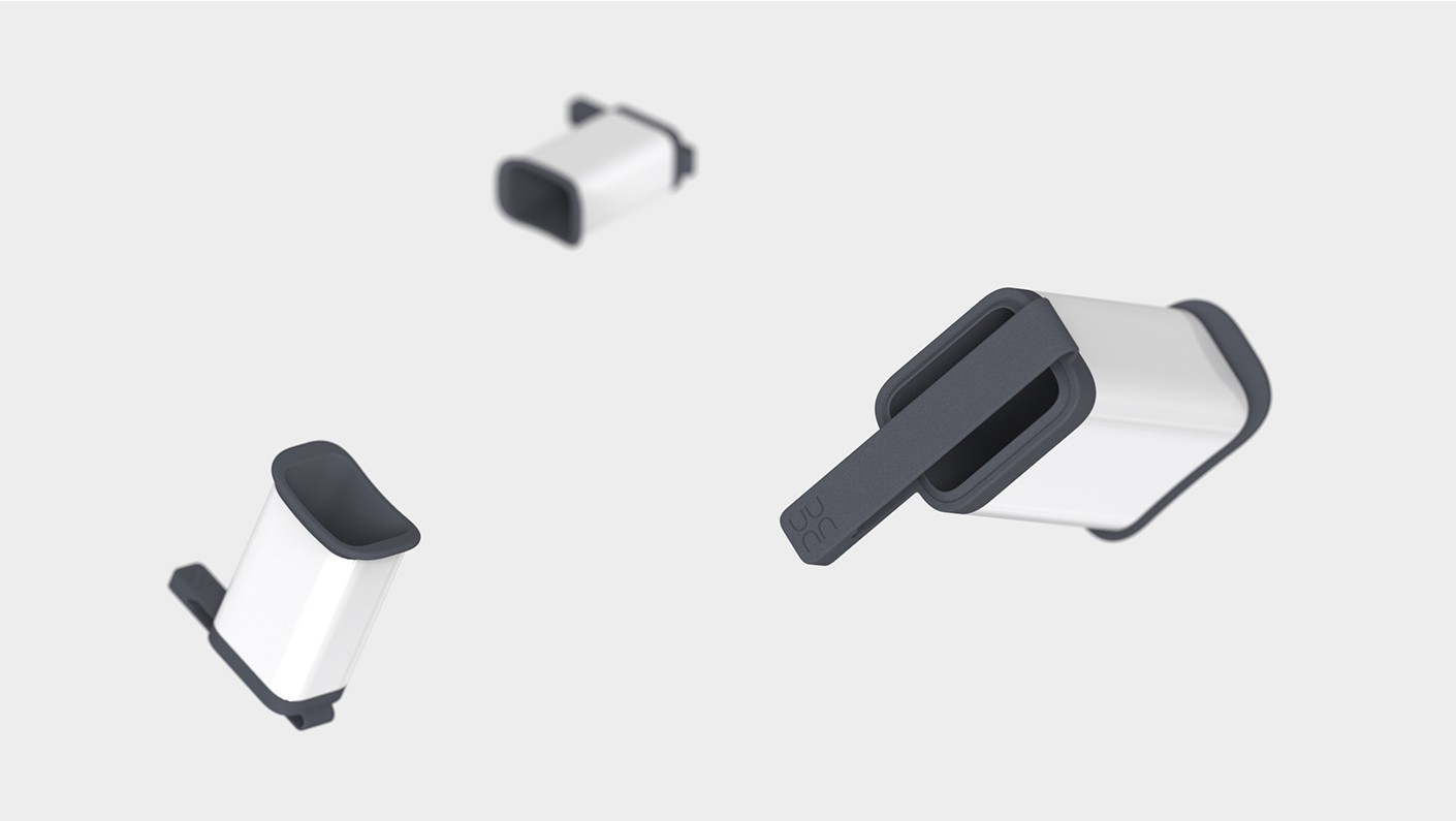
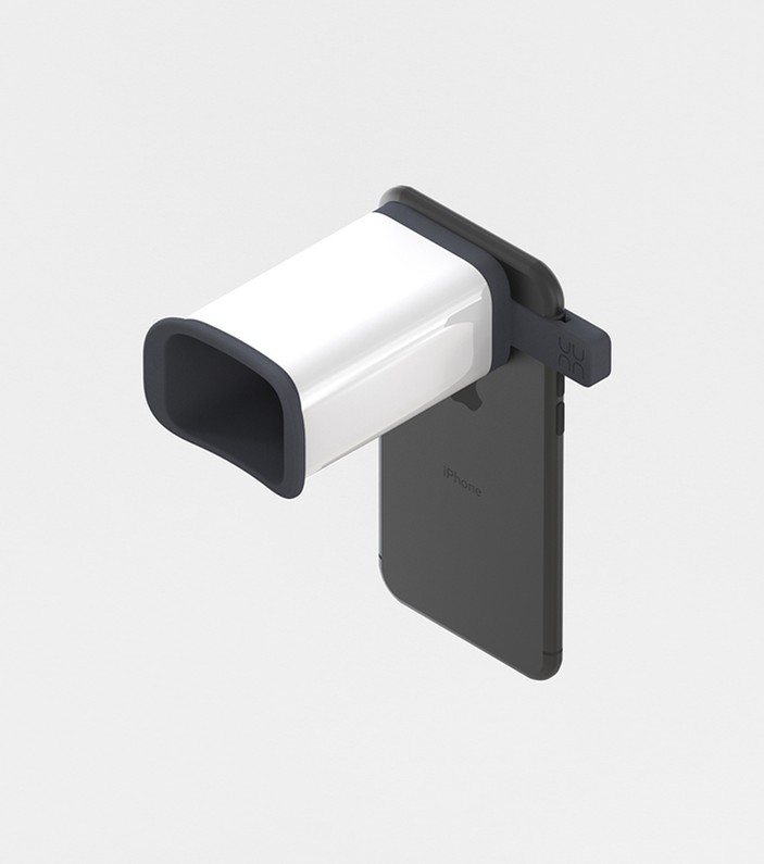
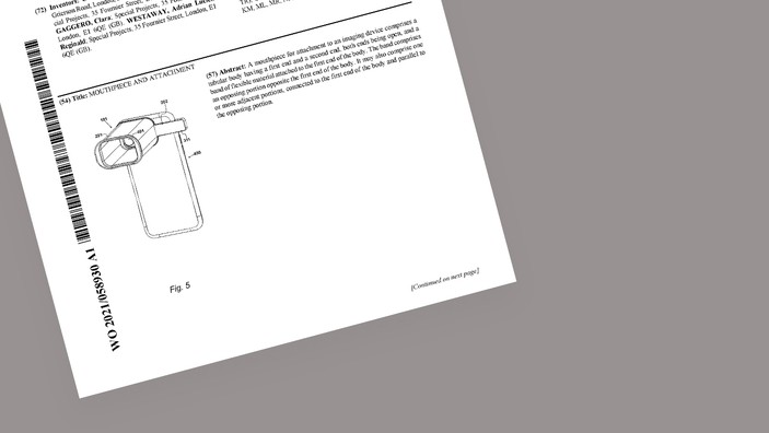
To empower as many people as possible to manage their own dental health, we designed the mouthpiece and attachment band to be universal - it fits on a huge variety of phones. To do this we came up with a moveable band which grips the phone. And to ensure that it doesn’t accidentally turn your screen off, or the volume down, there are notches within the band to accommodate the buttons on the side of the phone.
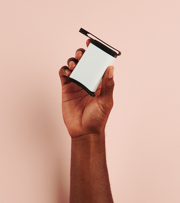
The mouthpiece is made from one piece of plastic, with no tricky hard to reach spots, making it easy to clean, as the research showed us that many users are frustrated and put off by the cleaning often required of dental products. And the mouthpiece is as small as possible to use as little material as possible. It is long lasting and uunn will responsibly recycle any unwanted mouthpieces if returned to them. And crucially, the design is accessible, timeless, and genderless, and will look at home in any bathroom, anywhere (because uunn doesn’t require batteries or charging it can be used at home and away). One of the things we love most about that mouthpiece is that it is inherently magical: simply by placing this little tube on your phone (the uunn lens!) you can magically see the plaque on your teeth and then watch it disappear (on the app!) over time.
"You won't know what it means to build a true solution and experience a well-thought-out and magical product development process until you work with Special Projects."
Gina Dorodvand & Hawaa Budraa
Onaria Technologies Founders
Onaria Technologies Founders
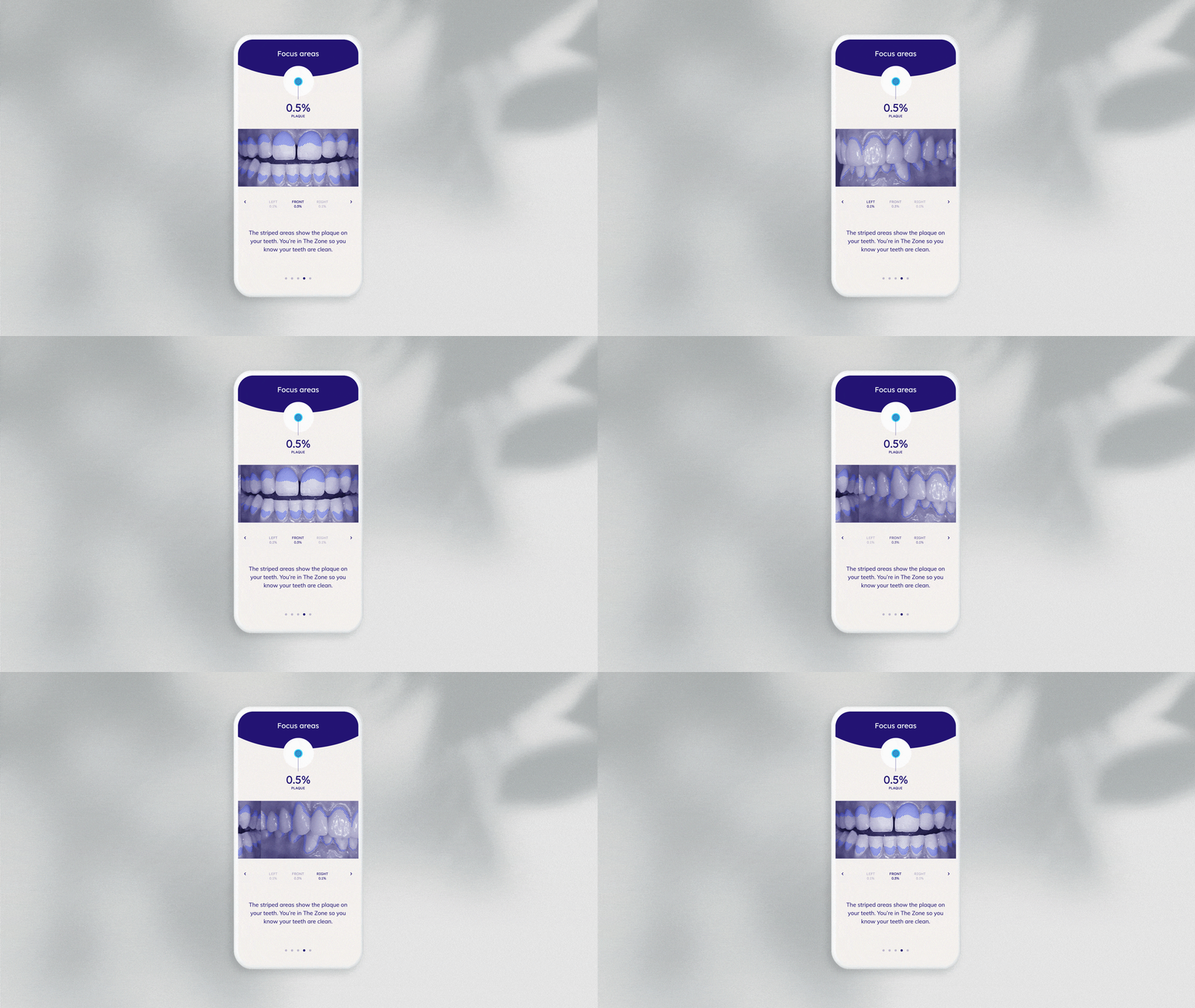
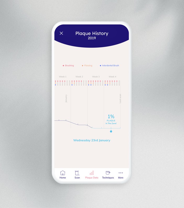
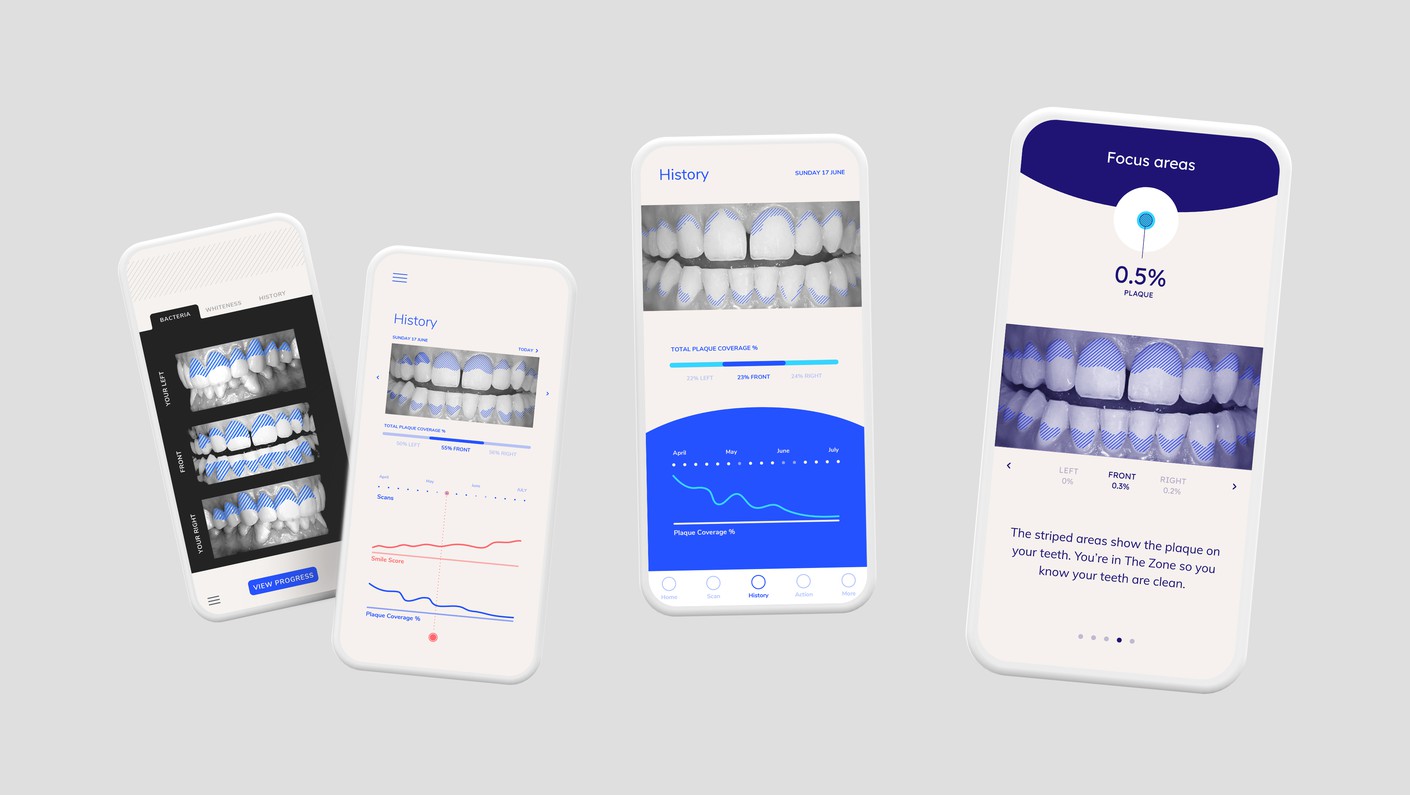
Our designs for the app continue with playfulness, and humour to humanise the technology, whilst communicating a significant amount of information. Our insight that users don’t enjoy looking at images of their own teeth prompted us to make all the images black and white, whilst the areas of plaque are shown in a blue candy stripe pattern, making the image more abstract and manageable for the user.
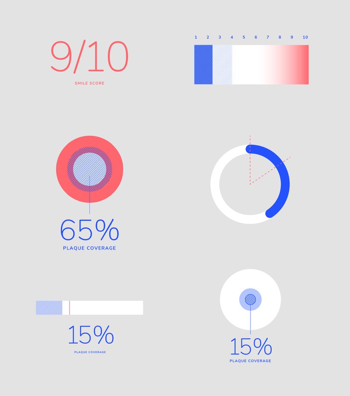
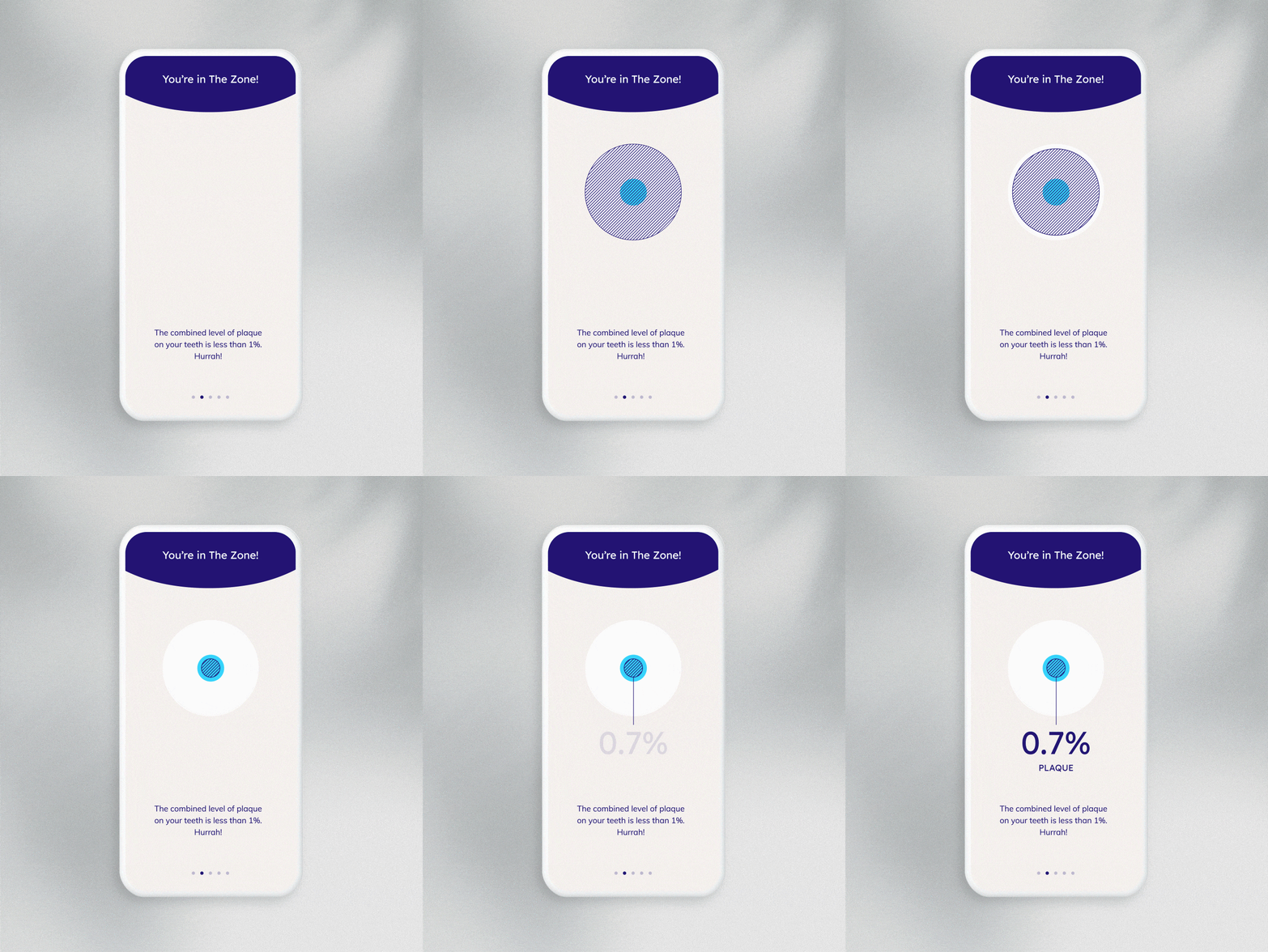
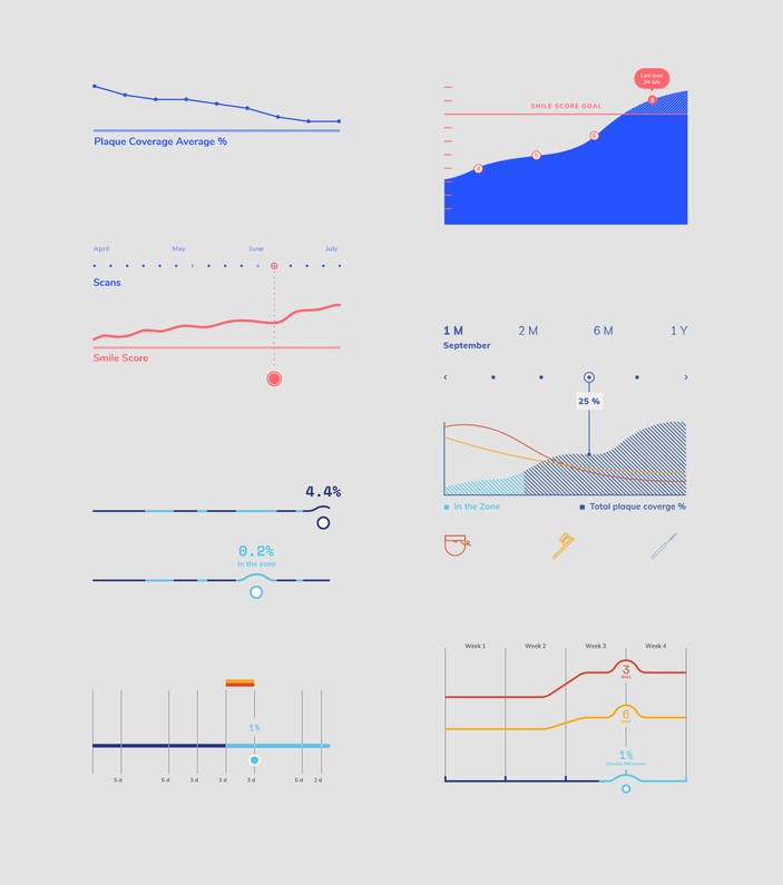
Together with the founders, we developed the concept of ‘the zone’ - a visual demonstration of the amount of plaque on the user’s teeth, with the optimal amount demonstrated as a central target. This provides the user with a pictorial way of tracking their progress without the need for complicated percentages or data sets, just easy to digest user progress and dental health history. In this way we interpret the data for the user, communicate this to them to inform and motivate them, and then demonstrate their progress to empower them to improve more. This is then further augmented with the animated mini-tutorials which are a far remove from the very competitive landscape more common in the dental category. This all contributes to the periodic habit building that is crucial to transforming dental health, as uunn and their dental health experts know.
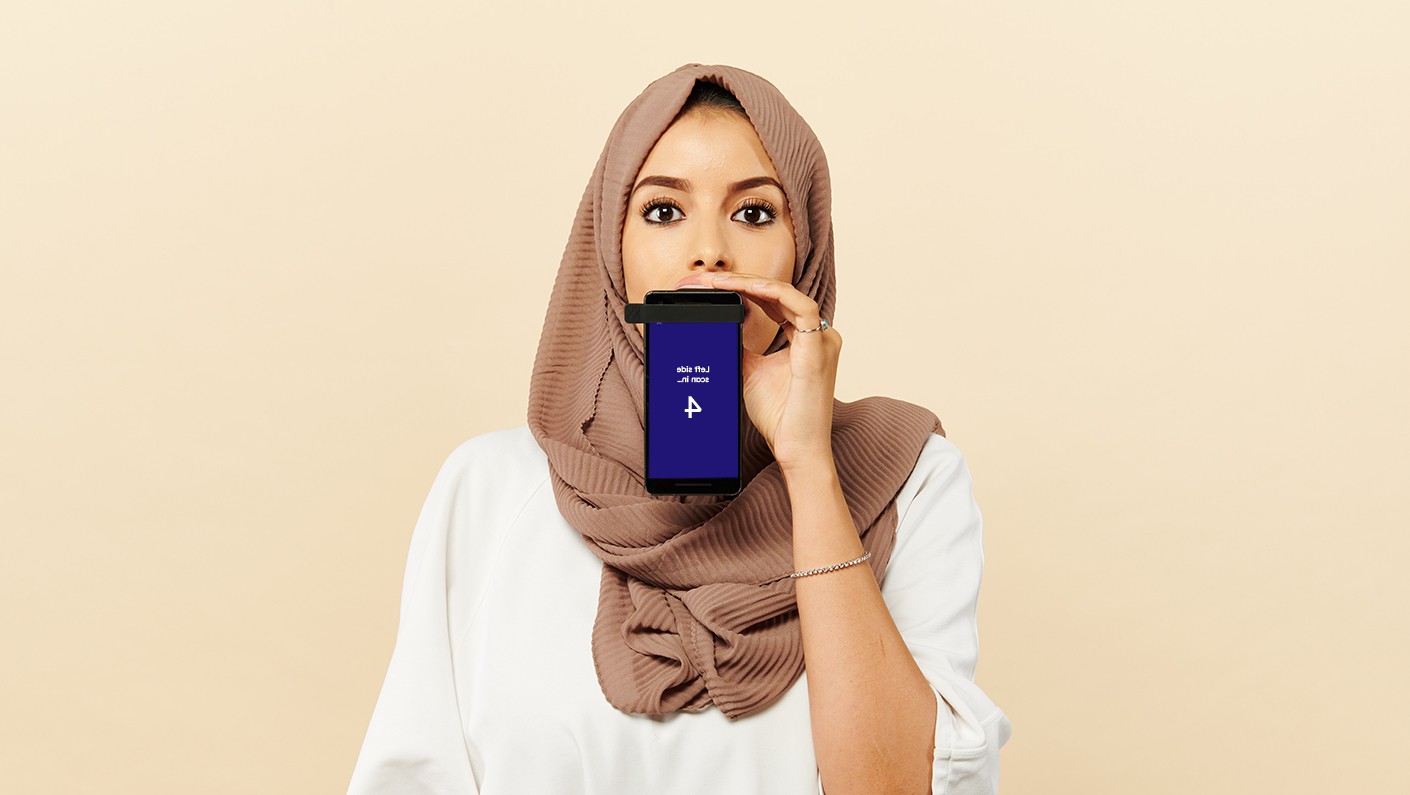
One of our favorite elements of the delight imbued design of uunn is the mirror writing used on the app to countdown to the pictures being taken - at this point the user will have the mouthpiece in their mouth, attached to their phone, so they will watch the countdown in the mirror. These small moments of delight ensure that the user feels considered and provided for, letting them know that their whole experience has been created, just for them, from beginning to end.
